
 I have a real interest in design history and I often find inspiration from early styles of graphic art. I recently acquired another copy of The Penrose Annual from a second-hand book store and as usual it contains a treasure trove of images and designs.
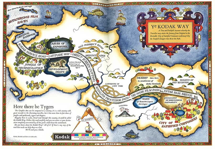
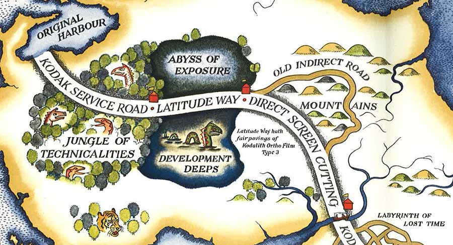
I love this old advertisement for Kodak in the style of an ancient map. It’s a fun, imaginative way of illustrating the problems and technical issues that are found in colour print reproduction. From the Jungle of Technical Difficulties, the Abyss of Exposure and the Development Deeps, we are carried on an wild adventure through the Labyrinth of Lost Time, the Sandstorms of Dusty Chemicals and the Quicksands of Dimensional Instability to finally arrive safely at the City of Satisfied Customers.
The map was designed and drawn in Kodak’s own art department, using a 1575 lithographic map of Christopher Saxton’s map of Somerset as reference. It was reproduced and printed in six colours by Colour Reproductions Ltd of Billericay, Essex, using Kodak materials exclusively.
The gallery was not found!
The finished artwork as it appears in the Penrose pages is gorgeous, especially when one is able to feel the texture and quality of the paper onto which it is printed (Penrose Annuals always included many different weights and types of paper and card bound seamlessly into the one volume).
Leave a Reply